So, it's the new year. Traditionally a time for reviewing, renewing and improving.
If one of your resolutions is to take better product photography (or just better photographs in general) you might be interested in a series of guest posts I wrote for Storenvy a while back.
Beginner's Photography Guide
This one covers the basics, no fancy camera needed. It also draws on a lot of points from the article I wrote way back: How to: Take great photos of jewelry
Intermediate Photography Guide
This one gets a little more advanced and introduces a few optional pieces of equipment and some settings you can use if you do have a fancy camera.
Editing Photos Guide
No matter how great you are at photography you will still need to edit pictures and editing can hide a multitude of sins, too. This guide covers the basic tools to enhance product photos.
Smartphone Photography Guide
I didn't write this one but its a great guide for people who don't have a camera at all. It's amazing what you can achieve with modern camera phones too, especially with additional editing software apps.
This site has moved! Old posts will remain here but new posts will be at www.embergrass.com/blog. Please go there to keep up with new content and re-subscribe!
Showing posts with label Photography. Show all posts
Friday, 13 January 2012
Friday, 19 August 2011
New Background
Much as I loved my grey slate backdrop for my photos, and the way it contrasted so nicely with the orange copper, I have decided to replace it.
The main reason for this decision was based around treasuries. When putting together a treasury people are usually looking for colours which match or at least complement each other. The dark grey slate background and the bright copper foreground gave my images 2 colours, items with coloured gemstones in would have 3 different colours. Reducing the number of colours in my images gives a higher chance that my images will fit in with the colour scheme of a treasury.
The other reason was the dark feel the slate gave to my images, in contrast to the light, airy feel I think my items have on their own and which I'm trying to portray. Whilst the grey fitted in fine with my old banner and site design of grey and white, it looks rather ugly on my new site and could also stand out too harshly in a treasury where all the other items have light backgrounds.
With my new DSLR camera I did consider having another go at producing a pure white background, figuring this would probably be a lot easier with a higher quality camera and RAW format images. However, in the end I decided that, whilst a bright, white background does look stunning and very classy for jewelry, it wasn't a good fit for my style. My jewelry is much softer, more casual and rustic and I felt a slightly warmer and textured backdrop was more appropriate.
Fortunately it didn't take me long to find the perfect thing. A quick (well it would have been quick if there hadn't been so many cool things for me to look at!) trip to The Container Store found me an awesome whitewashed wooden box, just the right size. I already love the difference it has made to the newer items in my store and I will be upgrading all the existing images over time. To see how it looks with a whole store of items with this background, check out my new website: http://www.embergrass.com
The main reason for this decision was based around treasuries. When putting together a treasury people are usually looking for colours which match or at least complement each other. The dark grey slate background and the bright copper foreground gave my images 2 colours, items with coloured gemstones in would have 3 different colours. Reducing the number of colours in my images gives a higher chance that my images will fit in with the colour scheme of a treasury.
![]() |
| My cat, checking out the new box while I was trying to take pictures! |
With my new DSLR camera I did consider having another go at producing a pure white background, figuring this would probably be a lot easier with a higher quality camera and RAW format images. However, in the end I decided that, whilst a bright, white background does look stunning and very classy for jewelry, it wasn't a good fit for my style. My jewelry is much softer, more casual and rustic and I felt a slightly warmer and textured backdrop was more appropriate.
Fortunately it didn't take me long to find the perfect thing. A quick (well it would have been quick if there hadn't been so many cool things for me to look at!) trip to The Container Store found me an awesome whitewashed wooden box, just the right size. I already love the difference it has made to the newer items in my store and I will be upgrading all the existing images over time. To see how it looks with a whole store of items with this background, check out my new website: http://www.embergrass.com
![]() |
| What do you think of the new background? |
Tuesday, 12 July 2011
New Camera!
If you follow me on facebook then you will know that I recently broke my old camera and had to replace it. I had already decided a few months ago that I wanted to upgrade my old camera (an advanced point-and-shoot) for a DSLR and I planned to save up the money for the new one from my jewelry sales.
Unfortunately the old one turned out to be at the end of its life span anyway and broke when I tried to upload my latest batch of pictures to my computer. The USB socket fell inside the camera and then must have shorted an internal connection as, after that, it would no longer turn on. I did buy it second hand in 2007 so I guess it had a reasonably long life as far as electronic items usually go.
Ultimately this worked in my favour as my husband bought my new one for me straight away and now I have to work on paying him back for it with the proceeds from sales. I had already put a lot of research into deciding which one I wanted to get (so I knew how much to save up) and I am now the proud owner of a Canon EOS Rebel T2i!
Words can't express how much happier I am with it than with my old one. Without changing anything about the way I take photos they all come out looking loads better anyway and it is so much easier to get the focus in the right place. One of the biggest advantages is the RAW file format, which allows the pictures to be edited in so many different ways and they can also be edited so much more before they start to look weird or fake.
![]() |
| Taken with my new camera in Yosemite |
Wednesday, 1 December 2010
Photography Revisited
Finally the sun came out, although it's gone again already. I did manage to take 150+ photos before it disappeared so here is the post I promised you a while back :)
Photographing my jewelry is something I have been working on for quite some time, as you will know if you read either of my previous posts on the subject.
I found a few backgrounds for my pictures (such as the turquoise dish and a piece of wood) and I was very pleased with the results. However, I hit a problem when I started making copper jewelry with coloured accents such as beads or coloured wire. On the dark wood background the copper pieces just don't really stand out enough but against a turquoise background any colours in the piece start to look weird. Additionally I really wanted all my items to be pictured on the same background so they would look great all together in my Etsy shop.
I tried really hard to master the white background for a while. I did get some success with it but for most images I was left with a choice between a grey background or some horribly over-exposed, colour enhanced piece of jewelry. Now I'm sure with more perseverence (and probably money spent on a light box) I could get good images on a white background every time but I actually think my style of jewelry fits a background better.
My jewelry has rustic, handmade charm whereas a white background (in my mind) speaks of high class elegance, diamonds and gold. I really liked the way my pieces worked with a natural background such as the wood so I found one that would contrast with my items no matter what colour they were - slate. I bought a piece of darkish grey slate (its actually a cheeseboard from Crate and Barrel), confident that it would be perfect but without having the chance to test it out first.
Today I tried it out for the first time and I am very happy with the results. I have yet to see what they will look like all together but the individual pictures are great and I think the slate matches the style of my jewelry perfectly.
Now I have finally sorted out a background I can use for all my items and taken photos of all my new designs I can get on and get them listed. You can preview some of them here in the next few days or on my Facebook page
![]() |
| The turquoise dish background |
I found a few backgrounds for my pictures (such as the turquoise dish and a piece of wood) and I was very pleased with the results. However, I hit a problem when I started making copper jewelry with coloured accents such as beads or coloured wire. On the dark wood background the copper pieces just don't really stand out enough but against a turquoise background any colours in the piece start to look weird. Additionally I really wanted all my items to be pictured on the same background so they would look great all together in my Etsy shop.
![]() |
| Grey background or overexposed earrings? |
My jewelry has rustic, handmade charm whereas a white background (in my mind) speaks of high class elegance, diamonds and gold. I really liked the way my pieces worked with a natural background such as the wood so I found one that would contrast with my items no matter what colour they were - slate. I bought a piece of darkish grey slate (its actually a cheeseboard from Crate and Barrel), confident that it would be perfect but without having the chance to test it out first.
Today I tried it out for the first time and I am very happy with the results. I have yet to see what they will look like all together but the individual pictures are great and I think the slate matches the style of my jewelry perfectly.
![]() |
| Some before and after pictures |
Wednesday, 4 August 2010
New challenges!
Being new to the whole jewelry making thing and also being the kind of person who loves to try new things rather than repeating old ones I am still constantly thinking of new ideas and trying out new techniques. I'd like to share a few of my most recent adventures into the unknown here :)
1. Photography
Particularly since my previous post on photography I have been thinking of new ways to make my pictures better and more eye-catching. This has mostly involved me coming up with new backgrounds to use and objects upon which to hang or lay my items.

My new wedding jewelry website (under construction) uses a light teal as the main colour so when I spotted this beautiful dish selling cheap in Chinatown I had to buy it. I wasn't entirely sure what I was going to use it for at the time but it has turned out to be a surprisingly good photo background and it's slight curve means I can hang small earrings from the side and have the hang down the ramp. Almost all of my wedding jewelry is white and/or silver so the coloured background won't be a problem and now I can be rid of the horrible grey backgrounds that look so boring without a coloured piece of jewelry.
I also went hunting on the beach and found several beautiful pieces of driftwood. I haven't really experimented with them yet but I'm sure they will look great in photos too! I'm hoping they will also double as display stands when I feel ready to start doing craft fairs.
2. Hair Accessories
Whilst creating my new wedding website I came to realise how few pieces I had for hair (and how few pieces I had in general but that's another story!). I avoid making tiaras and combs because they are very time and material consuming, always in the back of my mind thinking that I would make them as custom orders only. Of course this is stupid because no one will order one from me if they can't see samples to judge the quality of my work. I resolved to make a few more complicated hair pieces in the near future but in the meantime I came across this fantastic tutorial from Sew Sweet Stitches. It sounded so simple and looked so pretty - I had to try it!
Amazingly, it was just as simple as described! I bought polyester organza and it curled super quick over the candle so I may try with silk next time.
I stitched 3 tiny AB swarovski crystals into the centre and sewed the flower onto a kirby grip. This is definitely going to be a new addition to my wedding line and I'm going to experiment with clusters of flowers and alice bands too.
I follow Bead Flora and Jewels on facebook and twitter and see so many beautiful pictures of amazing beaded flowers! I used to just gaze at them in awe, always assuming that they were way too difficult to make myself. It took a request and a sketched design from a friend for me to actually have a go. I should have looked for a tutorial but I enjoy the challenge of seeing how things are made so I just went for it. The intial result was ok but left rather a lot of visible wire in the middle. After scrutinising the flowers some more I tried again and was very pleased and proud of the result! The hardest part was attaching it the the hair clip - something I still need to practise!
3. Cabochons
I keep seeing these intricate wire wrapped designs such as this one from Chileandreamer on Etsy. The central stone is a cabochon (bead without any holes in) so can't be attached to a chain in the usual way.
Another type of item which I was sure was far too complicated and intricate for me to make myself. Not to mention that it looks fiddly and I lack patience with fiddly things!
However, whilst strolling along the beach I came across 2 pieces of sea glass. I've seen sea glass on Etsy too so, of course, I picked them up and carried them home, again with no idea what I was going to do with them. I don't have the facilities to drill a hole through them so I decided to investigate this technique. Conveniently one of the blogs I follow posted a link to this tutorial just a few days ago! It turns out all these style items have the same basic idea and they aren't as fiddly as I imagined because you wrap the wire bundles together before you wrap them around the pendant. It is still quite tricky though and requires measuring and forward-planning, not something I usually bother with! But the tutorial was really good and I managed to wrap this piece of pale green sea glass with copper wire :)
The bumpy edges of the sea glass don't really lend themselves to this style of wire wrapping so I may try something different with my other piece. Nonetheless I'm happy with my first attempt and will be putting this pendant on my Etsy shop in the next few days.
1. Photography
Particularly since my previous post on photography I have been thinking of new ways to make my pictures better and more eye-catching. This has mostly involved me coming up with new backgrounds to use and objects upon which to hang or lay my items.
My new wedding jewelry website (under construction) uses a light teal as the main colour so when I spotted this beautiful dish selling cheap in Chinatown I had to buy it. I wasn't entirely sure what I was going to use it for at the time but it has turned out to be a surprisingly good photo background and it's slight curve means I can hang small earrings from the side and have the hang down the ramp. Almost all of my wedding jewelry is white and/or silver so the coloured background won't be a problem and now I can be rid of the horrible grey backgrounds that look so boring without a coloured piece of jewelry.
I also went hunting on the beach and found several beautiful pieces of driftwood. I haven't really experimented with them yet but I'm sure they will look great in photos too! I'm hoping they will also double as display stands when I feel ready to start doing craft fairs.
2. Hair Accessories
Whilst creating my new wedding website I came to realise how few pieces I had for hair (and how few pieces I had in general but that's another story!). I avoid making tiaras and combs because they are very time and material consuming, always in the back of my mind thinking that I would make them as custom orders only. Of course this is stupid because no one will order one from me if they can't see samples to judge the quality of my work. I resolved to make a few more complicated hair pieces in the near future but in the meantime I came across this fantastic tutorial from Sew Sweet Stitches. It sounded so simple and looked so pretty - I had to try it!
Amazingly, it was just as simple as described! I bought polyester organza and it curled super quick over the candle so I may try with silk next time.
I stitched 3 tiny AB swarovski crystals into the centre and sewed the flower onto a kirby grip. This is definitely going to be a new addition to my wedding line and I'm going to experiment with clusters of flowers and alice bands too.
3. Cabochons
I keep seeing these intricate wire wrapped designs such as this one from Chileandreamer on Etsy. The central stone is a cabochon (bead without any holes in) so can't be attached to a chain in the usual way.
However, whilst strolling along the beach I came across 2 pieces of sea glass. I've seen sea glass on Etsy too so, of course, I picked them up and carried them home, again with no idea what I was going to do with them. I don't have the facilities to drill a hole through them so I decided to investigate this technique. Conveniently one of the blogs I follow posted a link to this tutorial just a few days ago! It turns out all these style items have the same basic idea and they aren't as fiddly as I imagined because you wrap the wire bundles together before you wrap them around the pendant. It is still quite tricky though and requires measuring and forward-planning, not something I usually bother with! But the tutorial was really good and I managed to wrap this piece of pale green sea glass with copper wire :)
The bumpy edges of the sea glass don't really lend themselves to this style of wire wrapping so I may try something different with my other piece. Nonetheless I'm happy with my first attempt and will be putting this pendant on my Etsy shop in the next few days.
Sunday, 27 June 2010
How to: take great photos of jewelry
First of all I have to warn you that I can't give you all the answers on this! All I can do is to share my learning experience with you in the hope that there is something in it that might help you too.
To be a successful online seller you need skills in so many more areas besides making or finding great products to sell. Photography is one those skills and one of the most important ones too! If you are lucky you may have a friend who is a great photographer and willing to take your pictures for you or if you make a lot of money you can pay a professional to do it for you. For the rest of us we need to do the best we can.
Camera
I'm not going to lie, you need a decent camera. Not a top-of-the-range SLR but - for jewelry and other small things at least - one that has a macro mode. Don't worry about megapixels, even the cheapest camera phone these days has more than enough megapixels for online photos.
The quality of the image is important, some cameras can make it look like its foggy or there was a sandstorm. However this is another one you shouldn't need to worry about - most cameras with a macro mode will be decent quality.
Why do I need a macro mode? Macro mode allows you to take real closeups of your jewelry and still stay in focus. If you try to take closeups without it you will find it focuses on the background instead of the jewelry and then your beautiful jewelry will look blurred. Macro mode also de-focuses the background so it doesn't distract the viewer from the intended focus - the jewelry.
Light
Lighting is extremely important too. Trying to take pictures in artificial light leads to a yellow tinge to the item and the picture in general. Taking photos under a spotlight can work but tends to lead to areas which are very bright next to areas which are dark and dramatic and distracting shadows.
Whilst natural light is best, bright sunshine isn't always the best choice either as it can lead to pictures being overexposed and, again, very dramatic shadows. You can tone down direct sunlight by placing a thin white cloth in between the sun and the item to be photographed but the easiest thing to do is to find a well-lit spot that is out of the direct beam of the sun.
Background
The background you use for your pictures can have a huge impact on the way the viewer sees your items. Some aspects of choosing a background are common sense and its mostly just a case of trying different things until you find one that works with your pieces and fits with your style too.

Natural backgrounds like wood or rocks tend to work very well but you still need to be careful with the colours. I would not use a wood background for a picture of copper jewelry, for example.

A patterned background can look beautiful and add a certain style to all your pictures. Book pages are very popular or floral paper. However you should make sure that the pattern is not too bold and doesn't detract from your jewelry in any way.

A bright or contrasting background can make a bold statement and attract attention to your pieces. Just be careful it doesn't clash or alter the colour perceptions of your item. This pink background makes the turquoise beads look a different shade and presenting colours accurately online is difficult enough without complications like this!
Be very careful with a black background as it can suck the light out of your picture (left). If you use very bright light to compensate you end up with an overexposed picture instead (right).
If your black surface is reflective it can work but then you end up with a whole host of other issues!
Some items, especially earrings may work better if they are hung up rather than laid flat. Many people use a glass to hang them from with their background behind (make sure the glass is spotless!) but I find it can work well to stuff tissue paper into the glass and then hang the earrings so the direct background is the paper.
Items such as necklaces, on the other hand, may look good draped over an uneven surface such as a rock, or simply laid out in an interesting manner.
Background for crystals:
Whilst I have been happy with the quality of my pictures recently, until the other day I was still struggling to take good pictures of crystal-coloured swarovski crystals. The completely transparent nature of these beads means taking a picture of them is like trying to take a picture of a window.
I tried using a darkish background with some success but still wasn't completely happy with the focus on the beads.
Inspiration came when I was reading this blog by Angela Smith. I noticed that her photos of swarovski crystals are taken without a close background. Instead she has positioned the piece so there is nothing near to it and used the landscape behind as the background... and it works beautifully!

Of course I gave it a go, using my wall as the background and I am really pleased with the result. The focus is so much better and the space behind the piece allows more light to pass through it, accenting the facets.
Now I need to investigate with different backgrounds because I think this now looks far too grey and boring. Angela's look much nicer with the leafy green behind so I need to find somewhere nearby that I can use for the same effect! Oh and also set up a frame to hang them from.
Editing
My final section is about editing your pictures. Hopefully if you put in the effort to get the shot right to begin with, your photos will not need much editing. However there is one aspect that you will almost certainly still need to change - cropping. You don't need to pay for photoshop, there are loads of programs which will allow you to crop (and usually other simple things like changing the lighting). These days you probably even have one free with your computer. If not try the Gimp, its completely free and offers many of the same features of photoshop.
Be sure to crop your picture to remove as much of the background as possible - you want people to focus on the item you're selling.
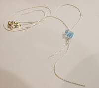
Don't be afraid to crop out parts of the item itself, especially if its large, to focus in on areas of detail or just a sample of the whole thing. The picture to the right features the entire necklace but doesn't stand out in anyway. From a distance you could be forgiven for thinking it was just an off-white square.
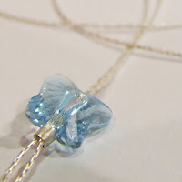
This picture is much more eye-catching. If you use a site like Etsy you can set the close-up, eye-grabbing picture as the main one for the item and then use the one that shows the full item as an extra for people who are interested and now want to gain an overall idea of the item.
It has taken me a while to refine my photo technique and I'm still working on it, so hopefully this will help to speed up the process for someone! If you have any great tips for taking photos of jewelry please add them to the comments below :)
To be a successful online seller you need skills in so many more areas besides making or finding great products to sell. Photography is one those skills and one of the most important ones too! If you are lucky you may have a friend who is a great photographer and willing to take your pictures for you or if you make a lot of money you can pay a professional to do it for you. For the rest of us we need to do the best we can.
Camera
I'm not going to lie, you need a decent camera. Not a top-of-the-range SLR but - for jewelry and other small things at least - one that has a macro mode. Don't worry about megapixels, even the cheapest camera phone these days has more than enough megapixels for online photos.
The quality of the image is important, some cameras can make it look like its foggy or there was a sandstorm. However this is another one you shouldn't need to worry about - most cameras with a macro mode will be decent quality.
Why do I need a macro mode? Macro mode allows you to take real closeups of your jewelry and still stay in focus. If you try to take closeups without it you will find it focuses on the background instead of the jewelry and then your beautiful jewelry will look blurred. Macro mode also de-focuses the background so it doesn't distract the viewer from the intended focus - the jewelry.
Light
Lighting is extremely important too. Trying to take pictures in artificial light leads to a yellow tinge to the item and the picture in general. Taking photos under a spotlight can work but tends to lead to areas which are very bright next to areas which are dark and dramatic and distracting shadows.
Whilst natural light is best, bright sunshine isn't always the best choice either as it can lead to pictures being overexposed and, again, very dramatic shadows. You can tone down direct sunlight by placing a thin white cloth in between the sun and the item to be photographed but the easiest thing to do is to find a well-lit spot that is out of the direct beam of the sun.
Background
The background you use for your pictures can have a huge impact on the way the viewer sees your items. Some aspects of choosing a background are common sense and its mostly just a case of trying different things until you find one that works with your pieces and fits with your style too.
Natural backgrounds like wood or rocks tend to work very well but you still need to be careful with the colours. I would not use a wood background for a picture of copper jewelry, for example.
A patterned background can look beautiful and add a certain style to all your pictures. Book pages are very popular or floral paper. However you should make sure that the pattern is not too bold and doesn't detract from your jewelry in any way.
A bright or contrasting background can make a bold statement and attract attention to your pieces. Just be careful it doesn't clash or alter the colour perceptions of your item. This pink background makes the turquoise beads look a different shade and presenting colours accurately online is difficult enough without complications like this!
Be very careful with a black background as it can suck the light out of your picture (left). If you use very bright light to compensate you end up with an overexposed picture instead (right).
If your black surface is reflective it can work but then you end up with a whole host of other issues!
Some items, especially earrings may work better if they are hung up rather than laid flat. Many people use a glass to hang them from with their background behind (make sure the glass is spotless!) but I find it can work well to stuff tissue paper into the glass and then hang the earrings so the direct background is the paper.
Items such as necklaces, on the other hand, may look good draped over an uneven surface such as a rock, or simply laid out in an interesting manner.
Background for crystals:
Whilst I have been happy with the quality of my pictures recently, until the other day I was still struggling to take good pictures of crystal-coloured swarovski crystals. The completely transparent nature of these beads means taking a picture of them is like trying to take a picture of a window.
Inspiration came when I was reading this blog by Angela Smith. I noticed that her photos of swarovski crystals are taken without a close background. Instead she has positioned the piece so there is nothing near to it and used the landscape behind as the background... and it works beautifully!
Of course I gave it a go, using my wall as the background and I am really pleased with the result. The focus is so much better and the space behind the piece allows more light to pass through it, accenting the facets.
Now I need to investigate with different backgrounds because I think this now looks far too grey and boring. Angela's look much nicer with the leafy green behind so I need to find somewhere nearby that I can use for the same effect! Oh and also set up a frame to hang them from.
Editing
My final section is about editing your pictures. Hopefully if you put in the effort to get the shot right to begin with, your photos will not need much editing. However there is one aspect that you will almost certainly still need to change - cropping. You don't need to pay for photoshop, there are loads of programs which will allow you to crop (and usually other simple things like changing the lighting). These days you probably even have one free with your computer. If not try the Gimp, its completely free and offers many of the same features of photoshop.
Be sure to crop your picture to remove as much of the background as possible - you want people to focus on the item you're selling.


Don't be afraid to crop out parts of the item itself, especially if its large, to focus in on areas of detail or just a sample of the whole thing. The picture to the right features the entire necklace but doesn't stand out in anyway. From a distance you could be forgiven for thinking it was just an off-white square.
This picture is much more eye-catching. If you use a site like Etsy you can set the close-up, eye-grabbing picture as the main one for the item and then use the one that shows the full item as an extra for people who are interested and now want to gain an overall idea of the item.
It has taken me a while to refine my photo technique and I'm still working on it, so hopefully this will help to speed up the process for someone! If you have any great tips for taking photos of jewelry please add them to the comments below :)
Subscribe to:
Posts (Atom)


